What fonts are you currently using on your system? Which do you think is best for the terminal or for your desktop environment?
(updates) Ok I think I’m a fan of Ubuntu nerd fonts right now
Noto Sans for sans-serif text (and the OS)
It’s legible, standard-looking and support about every writing system in the world. You can install it on Debian using# apt install fonts-noto, some others like-cjkand-extrahelp with the “supports about every writing system in the world”-aspect.Merriweather for the serif font fallback for the browser, as well as TTRPG campaign printouts
It’s very legible, and looks quite sexy for a serif font. There’s no package for it currently (although AUR and Nix users might have better luck), it has to be downloaded from Google FontsJetBrains Mono for the terminal TUI’s
It looks a bit playful, like lego-letters, is legible and supports about every writing system in the world.# apt install fonts-jetbrains-mono.Although I use…
Verdana for source code
It differentiates every character well and leaves enough space to easily recognise special characters such as brackets. And I don’t believe monospace fonts are more legible. It’s included inttf-mscorefonts-installerbut the font is not open-source.I love Eurostile Regular. Git it at https://freefonts.co/fonts/eurostile-regular
Please don’t hate me but for desktop I use Segoe UI. After years of using it everything else looks just kinda off and cheap to me. Similar to when folder icons are not yellow
It is a well-designed system font. Say what you will about Microsoft but they do know how to make a good font or two.
Nothing wrong with that! I prefer Inter for nearly all UIs these days, but I still think Segoe UI looks better than GNOME’s current default of Cantarell.
Iosevka.
Same. I’ve compiled a custom variant of Iosevka for terminal and code, because I want to have some chars in a certain way, especially the 0 and the & for even better readability. I used to have Monoid for code and terminal, but it the pixel perfect size for 12pt was getting too small for me and my eyes are not getting any better. Iosevka looks better even after some hinting by the OS.
On the rest of the desktop UI I use B612, because it is very ledgible, I recently switch over from the hyperledible Atkinson font. Before that I had Gidole on the desktop. Very pleasing, but not that readable at same font size.
Verdana, Tahoma and Source code pro is good for eyes
Whatever comes default with the current system.
Ubuntu font. Idk why but I like it.
I agree! Nice memories of hitting backspace in a Linux Mint terminal and hearing that weird-ass BWOUP sound.
I recommend Ubuntu Mono for Termux users. Look at this black-background beauty – way better than the angly flat default
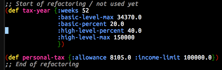
Since basically forever I use DejaVu Sans for UI elements and DejaVu Mono for the terminal.
I always use Dejavu sans mono for terminal and programming too. I think its the best in terms of readability where indentation is important
me too, I loved Verdana before I discovered FOSS and DejaVu Sans is basically FOSS Verdana
I like Maple Mono https://github.com/subframe7536/maple-font
An independent open source font, interesting. Looks pretty too, especially for multiple colors
🟨 preview: Maple Mono
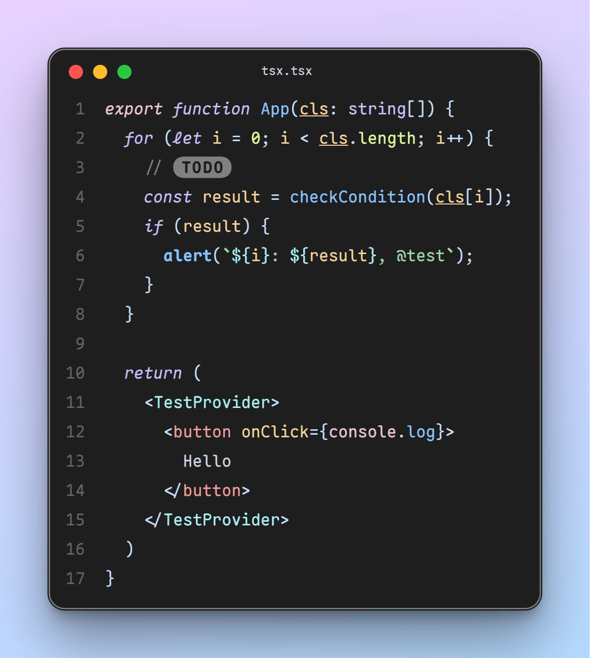
i want serifs. I use Go Mono for monospaced text. i’ve yet to find a good proportional slab serif font to match though.
By proportional slab serif do you mean unmonospacing the monospace like what Ubuntu does? I guess that’s why Go Proportional wouldn’t work being a sans serif
🟨 Preview: Go Mono
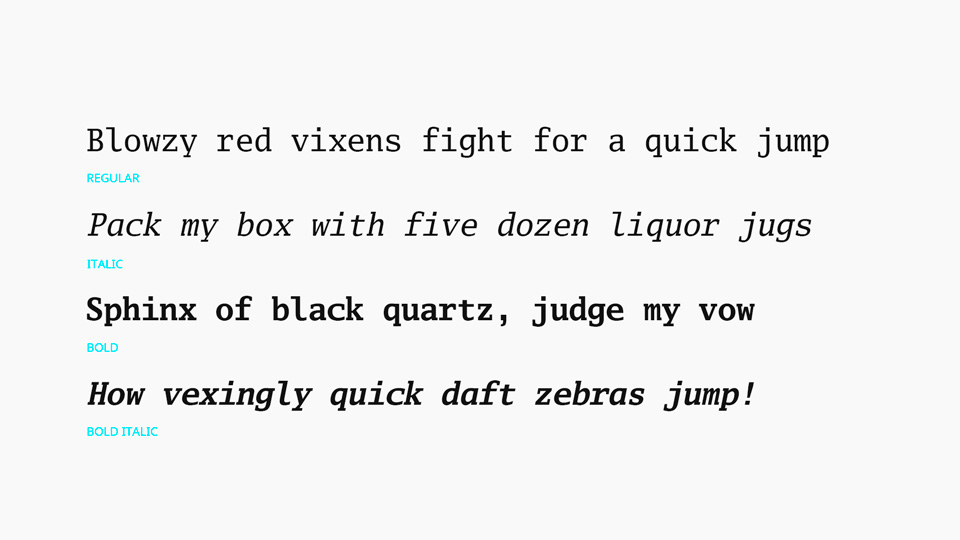
yeah just using the same characters but “squished” doesn’t work since the serifs take up the character space. you need a font designed as proportional. slab serif just means that the serifs are squared rather than pointed like on Times.
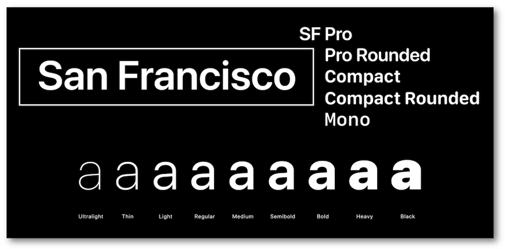
I always end up with SF Pro Display for my desktop. For terminal I’m happy with several mentioned here.
There are a lot of San Francisco fonts. Have you tried all of them? :p
🟨 preview: SF Pro display

🟨 preview: Other SF fonts
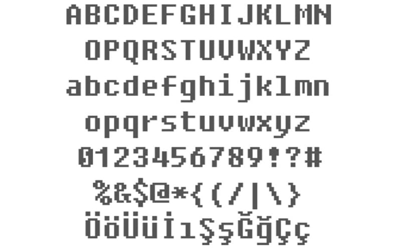
Fixedsys
Ohh, that’s what that 8bit-y font is called.
…wait. Why would you use 8bit as a system font???
🟨 preview: Fixedsys
Anyone using Nimbus Sans?
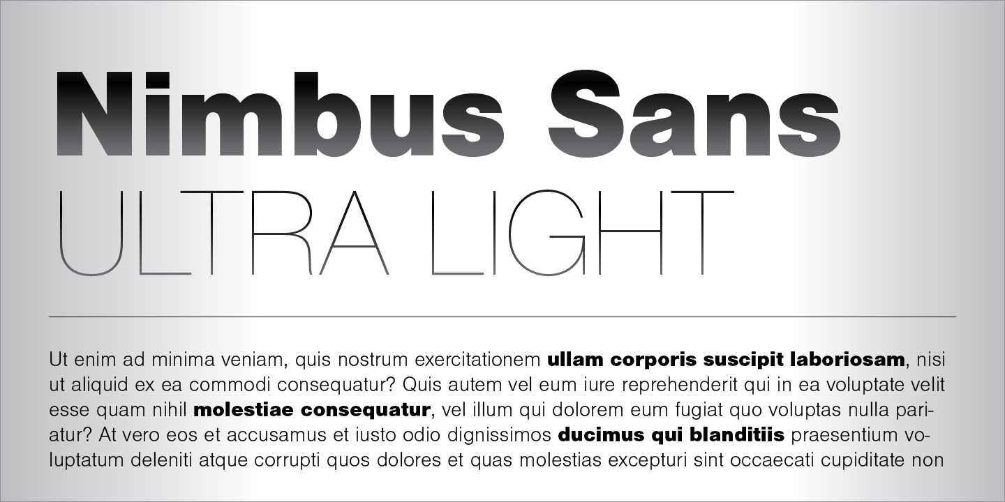
It’s actually preinstalled in a lot of systems. You can check via
gnome-font-viewerorfind /usr/share/fonts -name "*Nimbus*"@SolarPunker I use Exo2 as desktop font and FantasqueSansMono in terminal.
I know that this will anger some people, but I just use the defaults and I don’t get why there are so many fonts, since they don’t seem that much different to me.
I’m design nerd and definitely appreciate the variety but you don’t gotta be. The defaults are generally pretty good (if not great) with any major OS these days.
I don’t get why there are so many fonts
Because anyone can design one.