You must log in or # to comment.
Yes, but blue (Mercator) preserves direction and shape, which were all that really mattered for navigation by sea, so Mercator was a fantastic projection for centuries.
And we still use it today for smaller scale areas, since it does a remarkably good job at preserving all 4 features (shape, area, distance, and direction) close to the map origin line. Universal Transverse Mercator is a system that has 60 zones of Mercator turned sideways.
The reason it’s Transverse is because, unlike lattitude depending on a defined equator, longitude has an arbitrary meridian, so by turning the map sideways we can move the distortion point, and any map area that doesn’t stray too far East or West will be very accurate.
Think of trying to map something like Chile or Florida, where the area of interest is pretty far North to South, but not East to West.
Hmm, so the Mercator projection makes things look larger than they are? I think I’ve got an idea for another use for it… 😏
10 x 0 = 0
Slightly enlarging something that is microscopic doesn’t change much.
Your penis isn’t far enough north for it to help
All right, well first I may need to see a doctor.
Is that it?

Greenland: I was in the pool!
There’s shrinkage!
I don’t think Tasmania is right
Interesting how much closer kazakhstan (and by extension, china) is to europe when you see it like this. Like if the red outlines were all smooshed back closely together.
Crossing the globe north to south is the same distance as east to west, but since it is folded open on 2d maps it looks as if the earth is wider then it is higher. In this projection that means the map is stretched more horizontally than vertically, if i understand correctly.
In this projection that means the map is stretched more horizontally than vertically, if i understand correctly
You’re right! And yes, north to south is roughly the same distance as east to west. Subconsciously I’ve always felt like north to south is a quicker journey, but that was just Mercator playing a trick upon me
Crossing the globe north to south is the same distance as east to west
Not true, the earth isn’t a perfect sphere. Though I guess I’m just being nitpicky because I looked it up and it’s only ~27mi/43km longer along the equator.
Now guess where China builds railroads for exports to Europe.
Map Men Map Men Map Map Map Men Men!
So, these men… What is their area of expertise?
Glue
Huffing, or…?
Men map men map men map!
I’m curious if anyone ever made a “Super Mercator” projection, something where “ze west” is even more exaggerated and some continents even more disproportionately reduced missing/removed to own the libs. It kinda sounds like something governments would do/people would like nowadays.
Oh god, they made Boston the center of the world
Cursed
Show this map to Trump. I will not want Greenland anymore.
Acquiring Greenland would move the USA up 2 places in the list of largest countries (past Canada and China). That’s probably why he wants it.
It is quick becoming a very important strategic hub in the Arctic due to shipping lanes opening up due to global heating. Greenland is also continuously opening up to natural resource extraction as ice disappears, and they have vast quantities of a lot of very valuable shit under the ground that keeps getting easier to access for the same reason, like rare earth elements, oil, natural gas, copper, gold, zinc, uranium, lithium, tungsten, the list goes on…
Controlling and exploiting that land is a major strategic interest for all the big (and small) powers. That’s why he wants it, and everyone else too. Fuck his fat fucking ass though.
The dissonance with Trump is astonishing. The Arctic is recently becoming more important strategically due to ice disappearing, and yet he’s one of the biggest and most stubborn climate change deniers.
He just wants it ti deflect from the Epstein Files.
He wants to embed himself in the history as some kind of victor. It’s his sick phantasy to be presented in history books as a hero. That’s why he is doing everything he can to irreversibly leave his legacy wherever he can. That’s why he’s building the Epstein ballroom. That’s why he renames buildings and places after himself. That’s why he wants to create new colonies. He’s a narcissist.
Wait till he finds out it’s not green at all!
He knows it’s all ice. That why it’s called Iceland.
Go Robinson or Winkel.
https://futuremaps.com/blogs/news/top-10-world-map-projections
This just in: projection requires distortion.
Not if you project it onto an oblate spheroid.
There also an interactive version of this, also a bunch of copies (not sure if this is the original, but i believe so): https://thetruesize.com/
Doesn’t that kinda make Canada look smaller than the US?
Canada (9.98M sqkm) is only slightly larger than the US (9.83M sqkm), so it checks out that they’re really close in size here
Huh. I was convinced there was a bigger difference.
Russia gains most from this
Why is the difference only extremely pronounced in the northern hemisphere? If I understand the math behind the projection correctly, the equator should be true scale, and things should vary more the further north AND south you go.
This image shows the extreme southern latitudes to be almost equal to their true area. Is the image wrong, or am I misunderstanding something about the projection?
Antarctica is missing, which skews it heavily towards north
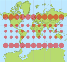
It doesn’t show Antarctica, but also there’s just more stuff in the far north than the far south (if we aren’t counting Antarctica)
This map is clipping a good chunk of the Southern Hemisphere. When you include it, you also notice the same distortion:

Note how it looks like Antarctica (14*10⁶km²) is 1/4~1/5 of the globe, even if it’s actually smaller than South America (18*10⁶km²).
huh. so flat earthers were right all along.

so they’ve gone full circle (or should I say sphere) and we really inhabit a sphere, just not the sphere the sheeple believe in? that’s amazing
And the sphere is specifically large enough so that the curvature is too small to measure. Except every experiment that they’ve done to prove the Earth is flat just ends up proving that it’s a sphere (or close enough) of the size we’re taught in school.
All flat Earthers are fucking stupid