This is a good and long coming change.
Reminder that the red depiction is also “wrong”, and not the equal area projection. The equal area projection map looks like this:
(Can’t upload pictures on blahaj piefed, HTTP 400 error)
In some senses, the red area is more wrong than the Mercator, since it is not a projection at all, but a false projection. The distances between the countries are misleading, especially when superimposed on the Mercator, which is also misleading in terms of sizes, but not shape.
All projections are compromises, but false projections are completely untethered from a mathematical relationship to the actual globe.
It is OK and not misleading if it were made clear that the red area is NOT a map, but a way of depicting the size only. Since it is shown in a geographic context with no disclaimer, i don’t think this is universally apparent.
Here is a link to a 3D globe: https://tembrica.com/en/earth-globe
Here is a good comparator of Mercator size vs equal size countries, not superimposed on a map. https://www.runcell.dev/tool/true-size-map/equal-earth-projection
Equal Earth
Areaprojection:
There are many equal area world map projections, this one is called Equal Earth. It’s a very solid choice too. Although the very top and bottom of this map are still stretched when viewed on a Tissot indicatrix. Still way better than the shitty Mercator.
Why is the Mercator shitty? It has its purpose and it’s good in it.
It’s great for countries in the middle, I.e Europe. Everyone else gets warped and slanted to the side.
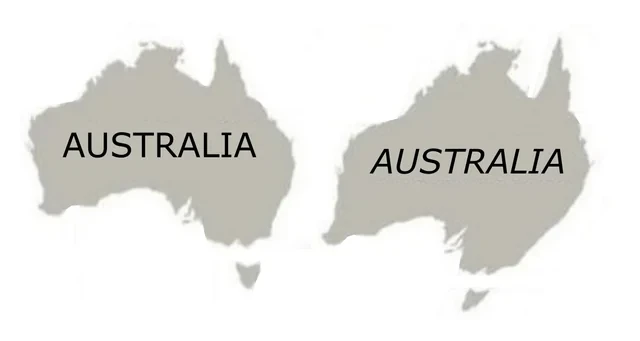
Gonna have to rename ourselves to Australia.
All world maps are inaccurate except a globe. Equal Earth still shows distortions when you move closer to the poles. Instead of stretching along the latitude it now compresses along the longitude
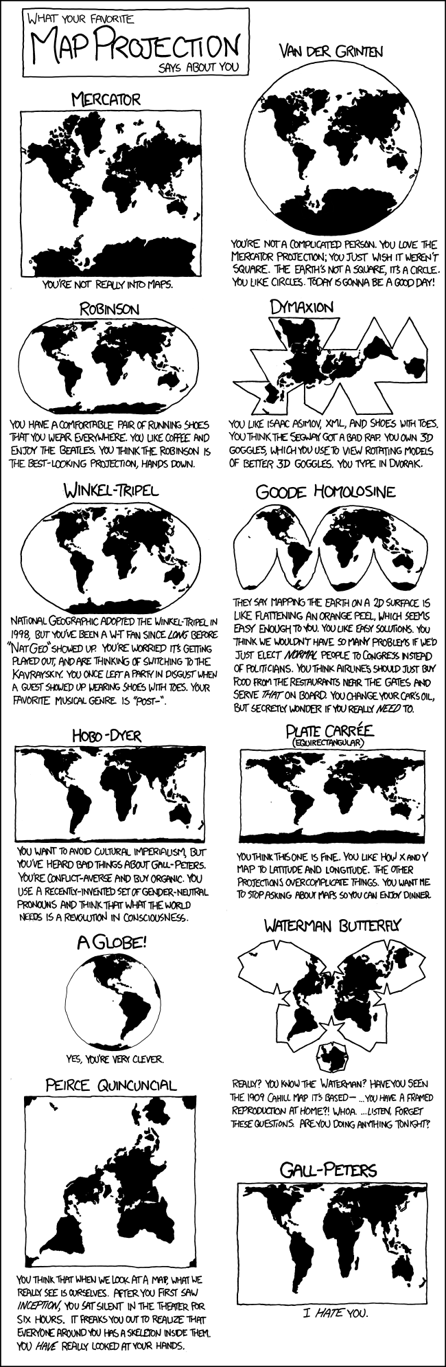
How about Dymaxion

It pits Russia + China against the US quite nicely over contested terriroty, whilst making the EU look like a belligerent hat, and rightfully casting the Aussies to the other side of the world
So where’s Antarctica on this map?
I’m sure that was high on the list of demands for African counties, kept in a debt trap and exploited.
Is that why they all voted Yes for this at the UN?
I’m convinced the only reason this went through now is because it makes Russia look much smaller lol. “Russia bad! You get shrunk now!”
Russia voted for it though, and the only country that voted against was the US
Well you just know why US voted against it, you can imagine the conversation with Trump “They want to do what? Make USA smaller???” *throws diaper at the poor US UN ambassador
And Russia voted for it strategically to appear as less of a threat. It’s already working too!
If USA votes against something, then it’s gotta be a great idea.
The equatorial countries just shrug.
Instance checks out lol
Mali voted yes too
heh
The title falsly implies that mercator is “incorrect”. Mercator is an angle preserving projection, meaning all angles are true to real life. The “equal earth” map is an area preserving projection, meaning it retains the true area of countries, but in return the angles are all wrong. This makes equal earth unsuitable for navigation for example.
It is also wrong to imply that this is some kind of new development. This was very much known all along, mercator simply became the default because world maps used to be primarily for navigation.
how is Canada smaller than the USA in this “equal earth” map when it’s supposed to display true areas? or is the pic in this post just shitty?
Canada (without the various arctic islands) is considerably smaller than the contiguous (sans Alaska and Hawaii) US.
Mercator projection is Canada’s pushup bra.
We’re repeatedly told in school and all throughout our media that Canada is the “second largest land mass in the world”. Is that not true?
Land mass or country? Because the Americas make us the second largest land mass with Eurasia and Africa because the largest.
Isn’t Africa connected to Eurasia? So we have the Americas and AfroEurasia plus some islands. Which is why “continents” has no meaning and is another social construct unless you divide them in a way that makes zero sense to anyone who isn’t a geologist.
We should divide the continents in:
Continents: the actual land, so we have the Americas (i’d count them as one as they are almost one), AfroEuroAsia
Sub continents: their definition is cultural so we have north and south america, Africa, Europe, Asia and Oceania
Don’t take anything too seriously, i thought about this on two feets around 2 years ago and forgot about that until now
Traditional navigation is so cool, I had to learn the basics of it a few years ago as part of a course I was on. I suspect it’ll feel rather less ceremonial in the future if GPS jamming and spoofing continue to become more common.
Did you know intercontinental missiles navigate with the stars? :o
They navigate by the stars, and then briefly turn into one.
We had some cartography classes in the university and since then I cant accept anything other than 3D globe or parts of it.
I don’t fly an airplane or sail a ship to need straight lines.
Yes, all of the 2D projections distort too much. When possible, half of the globe should be shown, from whichever angle is most relevant. Many people have no idea what a map centered on the North Pole looks like, and how close the countries in the northern hemisphere are to each other.
The title is incomplete, but then again the title is already pretty big without being “The UN has backed replacing the 500-year-old Mercator projection with maps that conform to the actual surface areas of the continents, including the Equal Earth cartographic projection, were appropriate”
Kind of amazed that something I got told in RE when I was about 11 is true.
When did they mention map projections in Resident Evil? I don’t remember that part of the game…
Relative Earthanomics is a course taught in European gymnasiums. Obviously.
Just another non issue. I can’t believe anyone other than cartographers really care. If you want accurate, get one of those blow up globes. Or most of the online mapping sites that turn into a globe when you zoom out far enough.
How will we deal with the spaces between the countries that will form? Especially the one under Russia
We call the Dutch, they’ll fill it up.
Gekoloniseerd!
What is shown is just an online tool for showing true continent size. This is the equal earth projection, and you’ve probably already seen it in schools:

That’s an equal area projection, and I hate that they named it Equal Earth when there’s many ways to skin that cat. There are many ways to do equal area projections, such as Albers, Lambert, Mollweide, and more.
https://en.wikipedia.org/wiki/Equal-area_projection
They really should use the Winkel Tripel. It’s a fantastic compromise projection that doesn’t perfectly preserve anything (area, shape, size, and direction), but also doesn’t horribly distort anything except for the shape of Antarctica.
Oh god, I think I’m in love:

Oo this one is nice

Do nothing. We are happy to see Russia going far away from the Finland.
Duh, bridges.
In other news: Trump doesn’t want Greenland anymore…
Every few years this comes up again, and every time some nonsense about colonialism or whatever is brought up.
There is no “true” size or “true” shape on a 2D projection of Earth’s very 3D surface. We used the one projection for so long because of how coastal shapes don’t get bent way out of proportion, but like with any projection, messes with the other aspects.
Rather than making spicy click bait titles every so often about the “true” projection of the Earth, how about we teach kids at school what it takes to project something 3D on a 2D surface?
And just use a fucking globe!
As a neurodivergent map person, I’m over-aware of the difficulties of map projection. And I agree that simply calling this new projection ‘accurate’ is misleading
But at the same time, the use of the Mercator as the standard default map in situations that have nothing to do with ocean navigation for literally hundreds of years is absolutely a reflection of the relative power of the Global North, and can’t be dismissed as ‘nonsense about colonialism’
What better alternative projection they could use at the time for navigation?
You might note that the present is, in fact, not 500 years ago.
Is that the answer to my question?
If you’re asking me to tell you the best way to navigate 500 years ago, I can’t help you because I’m not a historian. The point is that really has absolutely no bearing on how we should use maps today in the present.
And the present doesn’t affect the past.
from the perspective of an art conservationist i’m not entirely sure i agree.
some nonsense about colonialism or whatever
Wow imagine believing this nonsense. Privileged “or whatever” AF. Why do you think USA voted against this? Ofc it’s racist and colonial.
Then there is the politics. The United States voted against the resolution, insisting it was a distraction. But American resistance actually strengthens the argument of those who voted to change the map. If the map does not matter, why oppose it? If size does not matter, why insist on preserving the projection that makes the US appear larger? …
Moky Makura of Africa No Filter put it more sharply: “If we got something as basic as Africa’s size wrong for this long, what else about Africa have we simply accepted without questioning? Africa doesn’t need to be made bigger. It needs to be seen accurately.” …
The geopolitical implications of this generational shift should not be underestimated. The Mercator projection did not merely distort geography; it distorted ambition. For centuries, European and American leaders made decisions about Africa based on a visual representation that made the continent look insignificant. That misperception shaped colonial borders, investment decisions and strategic calculations. The Equal Earth projection will not erase that history, but ultimately, it will reshape how future leaders, African and non-African alike, conceive of the continent…
Dr Ikenna is right that the science of map projections is technical and trade-offs are unavoidable. But the politics of representation is not technical. It is about how people see the world and, more importantly, how they see themselves in it. Friday’s vote was not about changing geography. It was about changing perception. And perception, as every cartographer knows, is the map that matters most. - https://www.thecable.ng/the-mercator-myth-how-a-map-shaped-the-worlds-view-of-africa/
Isn’t this incorrect though? As far as I am aware it is possible to represent true size (equal-area) or true shape (conformal), but not both at the same time
For political uses new projection is better. UN body are not going to use that to navigate.
The only reason to have a default map is political.
People actually using maps and GIS pick whatever projection suits their needs - which is not Mercantor most of the time to begin with. I work with GIS a lot and never use it, unless forced by some API. But even then, reprojecting is trivial.
I’m so sick of this shit. You want an accurate map? Buy a globe. There is no accurate flat map projections. All are wrong. Different projections have different flaws and serve different purposes.
Yes, you’re very clever.
I think the world needs a revolution in consciousness.
Also, unless you’re using a paper map, you should never have to see a flat map projection.
We all carry around supercomputers in our pockets that can easily do the math to render a globe. If we want to use a bigger screen, they have even more powerful processors.
Does anybody actually use paper maps at all anymore? I guess sometimes people mount them on the wall and point at them, but I mean using a map to calculate distance, find a path, etc.
What’s ridiculous is that even though computers should be rendering the world as a globe, some websites (even Google Maps) still sometimes use Mercator. It’s especially ridiculous when it’s something like a flight-tracking website where the flight is going in a straight line on the globe, but is rendered as a curved path on a stupid map projection.
For most navigation people are going less than 50 miles projecting it onto a virtual globe would be pointless and not in any way shape or form beneficial.
So, you’re saying a more-or-less flat section of a globe should seem flat. Ok… and?
You said
“that even though computers should be rendering the world as a globe,”
They shouldn’t a projection is actually useful for most people in most instances. Your screen is flat and rendering a 3D image within it would actually mean you can use less of it and see less information in a more confusing view which would ultimately be weird and pointless to the people viewing mostly what is in fact stylized data like which roads cross.
Your screen is flat, and the surface of the planet is essentially flat. If a program starts with a mercator projection and zooms in on a particular area it’s always going to be a distorted view.
rendering a 3D image within it would actually mean you can use less of it and see less information in a more confusing view
Whaat? That’s nonsense.
Why do you think literally every mapping app on earth shows a projection onto the given x pixels by y pixels rather than a 3D rendering of a curved space again?
They don’t.
Watch out, UN. My idiot president is gonna get mad.
To be fair, that’s his resting state.
I’m kinda surprised there weren’t tons of countries against this. For its faults in representing size the Mercator projection is great at representing direction (that’s what it was intended for after all). For Japan, New Zealand, and even Austrailia this places North at really awkward angles, making what are in reality straight lines appear curved. If anything, this is even more euro centric than the Mercator projection due to the amount of straight line distortion applied being longitude dependent, centered around Europe. I’d also expect Russia to be against it since it makes them look smaller, even if they don’t have the same distortion problem as countries directly opposite Western Europe.
The projection should have been changed, but it should be a a compromise projection like Robinson or Winkel Tripel that doesn’t perfectly preserve area, distance, shape, or direction, but also doesn’t horribly distort any of them.
making what are in reality straight lines appear curved.
Totally unheard of before.

I feel like I’ve been lied to even though I knew about the mercater projection.
It’s because you have been lied to.
Fair