Not the best example: Eastern-European countries tend to overcompensate and overdo the painting, making the result too noisy. Nordic cities look much better, precisely because they choose muted and coordinated colors, and usually paint the whole house instead of making patchy blobs. It so happens that khrushchyovkas are again better at it too, because they were built smaller and painted in one color, often muted orange or brown.
The bottom image is heavily tuned to have more vibrant colors. No place in real life has such strong hues. I’d suspect that place in real life looks very much like the above image
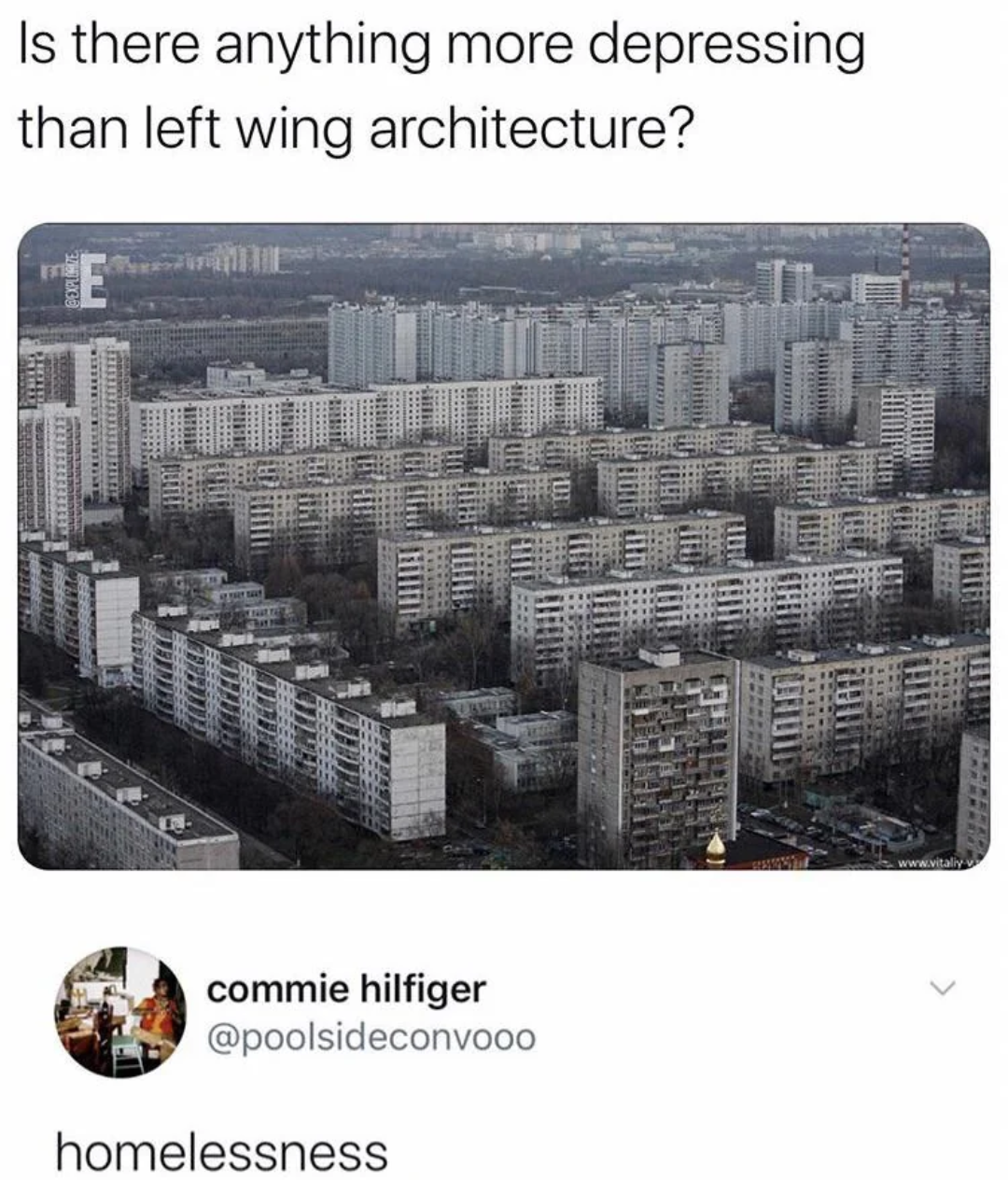
I did not say that I would consider those buildings in Petrzalka the height of all taste and beauty but the issue with it is not the colour of the buildings. It is the urban layout on ground level and the rundown horrendously car centric design. That is really dragging the area down. On the plus side, there is so much greenery even with all of that, that it is not looking grey there, certainly not during Spring-Autumn.
PS: Bratislava is west of Stockholm, has nothing to do with Orthodox Europe and Slovakia stopped being part of the East block almost as long ago as it was ever part of it.


Also, it helps not to reduce image saturation to zero and have the blocks somewhat decently maintained. A bit of paint makes also a huge difference:
https://bankfoto.info/zdjecia/petrzalka-3/ (Petrzalka, Bratislava)
Not the best example: Eastern-European countries tend to overcompensate and overdo the painting, making the result too noisy. Nordic cities look much better, precisely because they choose muted and coordinated colors, and usually paint the whole house instead of making patchy blobs. It so happens that khrushchyovkas are again better at it too, because they were built smaller and painted in one color, often muted orange or brown.
The bottom image is heavily tuned to have more vibrant colors. No place in real life has such strong hues. I’d suspect that place in real life looks very much like the above image
I did not say that I would consider those buildings in Petrzalka the height of all taste and beauty but the issue with it is not the colour of the buildings. It is the urban layout on ground level and the rundown horrendously car centric design. That is really dragging the area down. On the plus side, there is so much greenery even with all of that, that it is not looking grey there, certainly not during Spring-Autumn.
PS: Bratislava is west of Stockholm, has nothing to do with Orthodox Europe and Slovakia stopped being part of the East block almost as long ago as it was ever part of it.
here’s the image for other lazy bastards who don’t wanna click on a website like me:
Thank you, I never click on links anymore, not worth the occasional horror