
- cross-posted to:
- nottheonion@lemmy.world
- cross-posted to:
- nottheonion@lemmy.world
You must log in or # to comment.
Called it. They new coke’d that shit.
Was it really conservative backlash? I don’t think anyone liked it, lol.
The news sells better and is more engaging when you put it is conservative backslash instead of just overall negative reaction
Especially on this platform
Non-conservatives give a shit about cracker barrel?
I think I went there twice before they shut down here. I mean, it wasn’t AWFUL. I’d rather eat at a local place though.
https://www.pignpancake.com/our-story.html
I gotta meet up with the old people in my family somewhere. I’m not having them in my house are you crazy
LOL, that’s been the only reason I’ve ever set foot in one. People who were very much older in my extended family liked the place…and so for whatever reason, I kind of thought of the place like Grange halls - something the older bunch have an affinity for, but I don’t quite understand how it fits into my life in the here and now. :/
Have you tried literally anywhere else? Every few years my wife convinces me to try it again and it’s always the worst. Are there really no local breakfast places around?
Fortunately, I’ve got a few good diners to choose from
I don’t know. I don’t eat there often, but pretty much everything they make is good. I can’t even think of another place that makes chicken and dumplings… For that style of food, I would always take a higher end one off restaurant in the Carolina. But for something ubiquitous, it is pretty much the only option, and it isn’t as expensive as Shatley Springs or something.
Honestly, I would have tried it again more recently if it weren’t for the fact that they don’t seem to have any interest in accommodating vegetarians at all. Also, I think a few of them closed in Denver area.
Some people out there are really reluctant to branch out and try anything different. There’s a million places around me selling the same food but better, but some people just want to go to cracker barrel.
Old people especially, but also some people with, for example, autism, ARFID, etc. can be really picky about where they’ll eat, and sometimes it’s just not worth the aggravation of trying to get them to try something new.
Hell, I have some friends who aren’t even particularly picky who can be reluctant to try out new places. Restaurants aren’t cheap, I can understand being reluctant to spend money on food you’re not sure you’re going to like.
Restaurants aren’t cheap, I can understand being reluctant to spend money on food you’re not sure you’re going to like.
That and sometimes you have to go to the same restaurant a few times until you find the dishes that are good there…
I’m a Leftist Progressive living in North Carolina, and I like Cracker Barrel
Uhhh, there’s a shit ton of Cracker Barrels in NY, going to Cracker Barrel for family meet ups and shit was a staple in my family and made precious childhood memories for me, and we’re black as hell. Plenty of non conservatives love CB. There’s a shit ton black people makes jokes online rn about missing the “segregation” vibes of CB.
Just from a design perspective, there was too much wasted space
I only learned about it when I saw headlines about the backlash that was costing them millions.
My first reaction after figuring out it was not the Onion was…are they still in business? I honestly didn’t know they were still operating. I looked on the map in the Denver area and the one I thought was in Littleton/Lakewood area either is a figment of my imagination, or they closed.
Yes. It was.
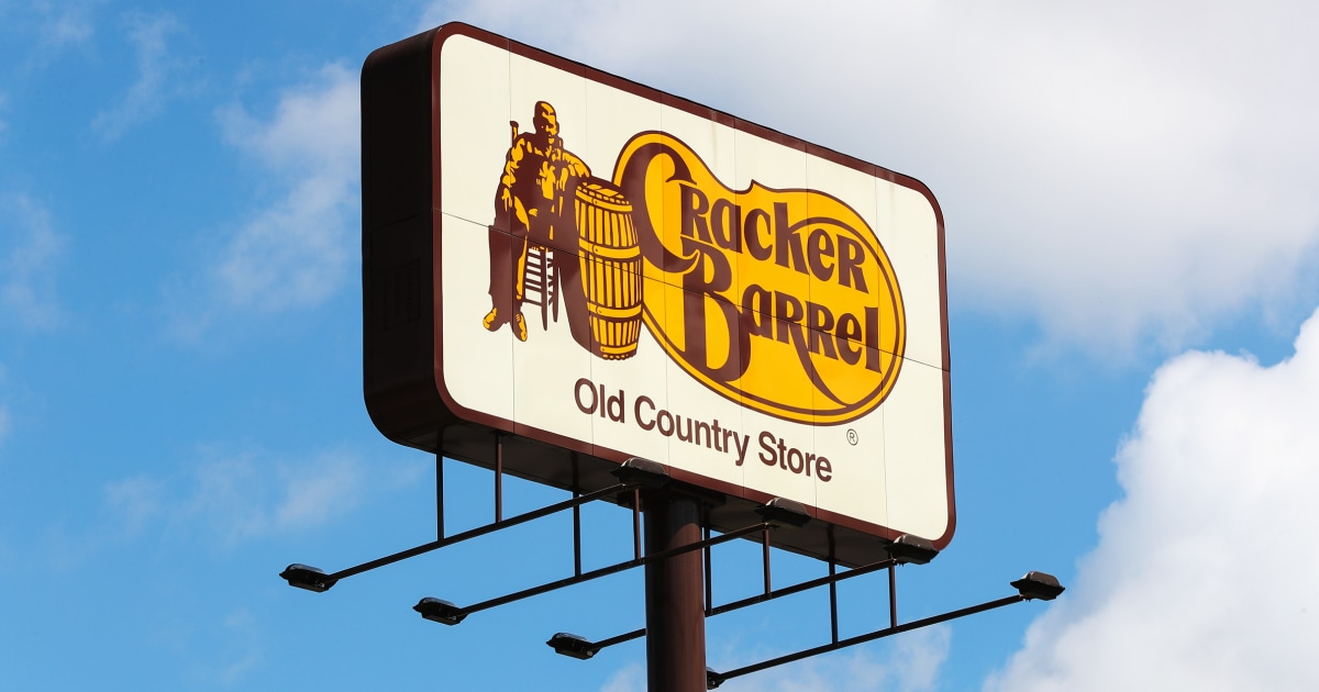
The reaction has been absurd, but their new logo was definitely awful.
How was it awful?
Could you tell me what the heck this yellow blob shape is supposed to be?

From a purely graphic design perspective, the classic logo is too busy and doesn’t scale well. The only thing it has going for it is the weirdness of the shape and the distinct color combination. It’s technically a really bad logo. You may not prefer the new logo but, technically, it’s a whole lot better. It’s far more adaptable to newer platforms while stilling being recognizable. Now, as far as being an effective representation of the brand and if that’s a corporate concern, I don’t know that I can comment on that.
In another post about this, someone posted a bunch of other fast food logos, and they all looked very much the same, especially in silhouette. They’re all just a same-y blend of mediocrity, whereas the existing logo was at least unique.
McDonald’s probably has the best and most distinctive logo out of anyone.
Who cares
Yellow blob is obviously a speech bubble.
Its not a speech bubble, its what the awful food will look like coming out on the other end of the tunnel
I don’t know if you’re serious or not.
The yellow blob is a pinto bean. :)
I thought it was some splooge.
The barrel ain’t just full of crackers
100%, right here.
I don’t think that the old logo is great either, and the update did improve on technical aspects. You don’t want to have all that small text, for example. And generally, simpler logos are preferable.
But…their shtick is a rustic feel. Whatever you can say about the original logo, it did evoke that. I have a hard time seeing the new one doing that.
EDIT: I also think that this compares favorably to another controversial recent rebrand: Musk rebranding Twitter, which was generally seen as not a good idea; Twitter already had a strong brand identity. People weren’t happy and Musk went right ahead with it regardless. At Cracker Barrel, the initial response was “calm down, it’ll be okay”, but they were willing to second-guess themselves, even though I expect that there were people there who were invested in the rebrand.
EDIT2: They’d also done smaller, more incremental changes to the logo in the past, because the “Old Country Store” text had had its typeface changed at some point in the past.
EDIT3: Here’s a more-comprehensive history:
https://dwglogo.com/cracker-barrel-logo/

I do find it amusing that the “classic” logo everyone is pining for is from the “ancient” year of 1997…
I think there’s a mistake, other sources say 1977 instead of 1997…
Tbf as weird as it sounds, ‘97 is vintage now
Officially 28 years ago
Counts on hands… Oh yeah, it’s over 10 years now isn’t it?
I hate you for pointing that out.
According to another site, the logo was 1977, not 1997. Which tracks with another article mentioning a marketing person coming up with the design in the 70s
On the long drive to and from vacation last week I noticed the 2024-25 picture used a lot and I thought wait they already have a version without the other stuff and it looks fine so why the hell are they changing it again when its perfectly fine the way it is? My biggest complaint of the newest one was just that it featured no border. It already looked weird, but without that border, it just didn’t work at all.
If they’d just textured the background shape to actually look like a barrel it would be pretty good actually.
Who gives a fuck? Let’s focus on the fascist takeover happening in every city in the country, and the billionaires almost completely winning the war on the populace.
Jesus, we’re allowed to think about other things every so often, it doesn’t have to be US politics 24/7
I mean, the headline literally talks about conservative snowflakes, it’s kind of related
Kinda wish the public had a similar outrage when Fruit of the Loom modernized their logo in 2000, lol
I’m more upset about Mr Pringle.
Lost not only his hair, but the twinkle in his eye, poor chap.
I just wish they didn’t try to gaslight humanity into believing there was never a cornucopia
It was fine, Jesus Christ
I’ve never seen people freak out so hard over a LOGO change. Jesus, it’s not like they changed the typeface to Comic Sans or Papyrus or some shit!
It was really shit rebrand though
deleted by creator
Because everything in the United States has been turned into “us vs them” crap.
Jaguar cars: am I a joke to you?
Jaguar was less about the logo and more about that whole marketing campaign. It was like they were doing a cologne commercial and left out the car completely. The logo change was the least of it.
When we did finally see the car, it looked like an AI generated concept, not an actual car. :(
Bunch of snowflakes wanting their safe space
Nothing wrong with Comic Sans. It’s highly readable for many people.
oh man. so thankful. just biting my nails about the cracker barrel logo.
Just what we needed. Conservatives feeling even more empowered. Goddamnit.
Maybe this success will inspire them to redirect their attention from politics to corporate branding practices.
I wish they would target Netflix and their recent UI update next.

I am so confused as to why anyone gives a fucking shit about this.
same thing happened with the sydney sweeney ad. all i care about is them titties
People are bored because their lives are easy. That will change soon.
Go figure. The people that hate change hated it enough to force a corporation to keep their logo.
conservatives are anti-progress.
Also, Cracker Barrel sucks.
Also my take. Who the fuck cares?
The backlash from the racist bigots you mean. Where else are they going to go after church to be mean to the wait staff
The title already says Conservative though.
Yeah. But fuck em. Call em what they are.
The new logo did not go over well in some spheres, and on social media, conservative critics accused the restaurant chain of abandoning its traditional values or of being “woke.”
When someone uses the word ‘woke’ as an unironic insult, I’ll probably think it’s stupid, but at least I understand what they’re saying. Until now, that is. What the fuck is “woke” supposed to mean in this context? What makes this bland logo change “woke”?
There was a man on the old logo and no man on the new logo. Totally woke.
They had some lgbt hires and dei stuff a few years ago and the ceo and is a woman so the new logo is clearly the end result of all that woke (reading: anything not catering to straight white males) nonsense
What the fuck is “woke” supposed to mean in this context? What makes this bland logo change “woke”?
Woke is anything that I don’t like.

I thought this was the onion 100%
Wait a minute. The logo is literally a cracker and a barrel 🤣. I’m surprised conservatives are ok being made fun of.
🌨️
❄️